This week I've been working on a batch of business cards, it went through a few concepts and I was really grateful for all the feedback I got from friends.
 |
| 1. Ring and information, taken from this picture. |
 |
| 2. Confetti with information, taken from this picture. |
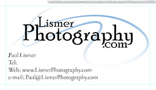 |
| 3. Without the background to keep it clean and tidy. |
After a couple of days of pondering and suggestions from friends I ended up with these
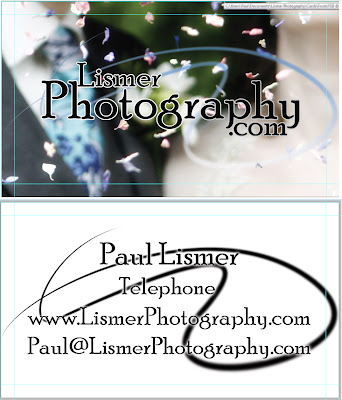 |
| Top is the front and below is the back of the card. |
The front no longer has any information on it and i made the text easier to read with a simple outline. On the reverse I tidied up the information, removing the "Tel", "Web" and "Email".
In-between these screen shots and sending it off to the printers I brought the logo swirl in by 5%, as I know printers often muck up the edges... It'd annoy me if it got trimmed off.


No comments:
Post a Comment