Thursday 23 February 2012

Business Cards...

This week I've been working on a batch of business cards, it went through a few concepts and I was really grateful for all the feedback I got from friends.

1. Ring and information, taken from this picture.

2. Confetti with information, taken from this picture.

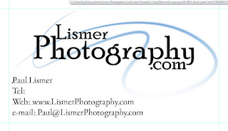
3. Without the background to keep it clean and tidy.

 After a couple of days of pondering and suggestions from friends I ended up with these

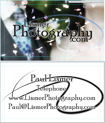
Top is the front and below is the back of the card.
The front no longer has any information on it and i made the text easier to read with a simple outline. On the reverse I tidied up the information, removing the "Tel", "Web" and "Email".

In-between these screen shots and sending it off to the printers I brought the logo swirl in by 5%, as I know printers often muck up the edges... It'd annoy me if it got trimmed off.

Friday 3 February 2012

Photo Project 1, 4. Diptych

Day 4 in the photo project was "Diptych or Triptych" for the full list of days click here. I Tried a couple of things for diptych, after looking it up in the dictionary (apparently two paintings attached on hinges and well I'm fresh out of these).

However, I do have a great little 3D date saver for my brothers wedding - which he drew himself.

 
The lego ninja lives in there, he's not really relevant.

Thursday 2 February 2012

Photo Project 1, 3. Emotion.

Right, despite what I said on the last picture about avoiding coffee... it's back.

Colours tweaked and given a retro feel. Also, the heart was taken from a different photo as it lined up with the blank side of the mug - which was annoying.

Mug from here...
Heart from here
But for those of you who think a wedding photographer should have more emotional pictures than a mug of coffee I have a spare.


It's rare I change the picture ratio - but here it worked well cutting out the stained glass, bringing focus in to the newly weds (Matt & Olivia).
I struggled to re-edit these, as to be honest I'd played with every setting before hand... so if all else fails just make it look more vintage. For bucket loads more emotion visit my portfolio.